

Marketing cohort analysis groups customers by a shared starting point, such as sign-up week or first purchase, so you can compare like-for-like retention, revenue, and activation over time instead of watching one blended average drift. It answers a sharper question than simple retention: not “are we losing customers?” but “which customers, acquired how, are we losing, and when?” Done well, it tells you which channels bring durable customers, which onboarding step actually drives retention, and how D7/D30 retention and net dollar retention should shape your next budget decision.
TL;DR:
- Cohort analysis reveals that channels like paid search may bring in users with lower retention compared to referral sources, highlighting the importance of channel quality.
- Behavioral cohorts can identify key activation actions, such as connecting a second tool within seven days, which significantly improve 60-day retention.
- Using revenue cohorts, an output above 100% indicates expansion revenue exceeds churn, signaling strong upselling success within specific groups.
- Reliable cohort insights require clear definitions, minimum sample sizes of at least 100 users per cohort, and filtering out bot and internal traffic.
- Automating cohort analysis pipelines with AI tools ensures regular, accurate updates that directly inform marketing and product decisions.
Table of Contents
- What is cohort analysis, and which type do you need?
- What marketing decisions cohort data actually drives
- How to run a cohort analysis step by step
- Worked examples: retention, revenue, and behavioural cohorts
- Where cohort analysis goes wrong
- A cohort audit checklist
- When cohort analysis should be a priority
- Turning cohort insight into a working pipeline
- Sources
- FAQ
What is cohort analysis, and which type do you need?
Cohort analysis differs from a single retention curve because it isolates groups instead of blending them. A blended chart might show 40% retention overall while hiding that customers acquired through paid search retain at 55% and those from a referral push retain at 20%. Cohorts expose that gap.
There are three cohort types worth knowing, and each answers a different question:
- Acquisition (time-based) cohorts group users by when they first arrived, weekly or monthly. These answer: “Is retention improving or decaying release over release?”
- Behavioural (event-based) cohorts group users by an action they took, such as completing onboarding or hitting a usage threshold. Mixpanel’s research on cohort analysis points to behavioural cohorts as the fastest route to finding the activation event that predicts long-term retention.
- Revenue (dollar) cohorts group users by first purchase date and track spend instead of headcount. These reveal whether expansion revenue is outrunning churn within a cohort.
Choosing week versus month granularity comes down to volume and product cycle. Weekly-active products (a daily habit tool, a subscription box) need weekly cohorts to catch early signal; monthly-active products (B2B SaaS with a longer usage rhythm) tend to produce noisy, sparse weekly cohorts and read better on a monthly grid.
What marketing decisions cohort data actually drives
Cohort tables earn their place on a dashboard when they change a decision, not just a chart. The most immediate use is comparing acquisition channels on quality, not volume. A channel that brings in twice the sign-ups but half the 30-day retention is not the win the top-line report suggests.
Cohorts also surface activation events, the specific action that separates customers who stick from customers who churn early. Once you find it (completing a first project, connecting a second integration, inviting a teammate), marketing and product can build campaigns and lifecycle flows around driving that action faster.
Cohort-based LTV divergence by channel justifies reallocating spend. When cohort-derived LTV by acquisition source diverges materially between channels, that gap is the case for shifting budget or running a controlled test before assuming volume alone is a win.
Practical outputs to bring to a budget meeting:
- Cohort-specific payback period (months to recover CAC for that acquisition month)
- LTV:CAC ratio calculated per cohort, not blended across all customers
- D7 and D30 retention trend across the last six acquisition cohorts
- Net dollar retention at a fixed cohort age (90 or 180 days)
How to run a cohort analysis step by step
Building a credible cohort analysis is a five-step process, and skipping the definition step is where most reports go wrong.
- Define the anchor event. This is the date that puts a customer into a cohort: first sign-up, first purchase, first paid conversion. Pick one and do not mix definitions across cohorts.
- Define what counts as “active.” Vague activity rules are the single biggest source of misleading cohort charts. “Active” should mean a specific, loggable event, such as a login plus one core action, not “visited the site.”
- Choose your interval and check sample size. Weekly cohorts under roughly 100 to 200 users per cohort get noisy fast; if your weekly volume is thin, switch to monthly cohorts until scale improves.
- Extract and pivot the data. A
date_trunccohort key plus offset columns is the standard pattern, and it is portable across warehouses. Basedash’s cohort analysis guide confirms this same date_trunc-plus-offset approach works in PostgreSQL, BigQuery, and most BI tools without modification. - Build and read the triangle. Cohorts sit as rows, offset periods (week 0, week 1, week 2…) sit as columns. Read down a column to compare cohorts at the same age; read across a row to watch one cohort decay.
A simplified pseudo-SQL pattern looks like this:
SELECT
  date_trunc('week', first_event_date) AS cohort_week,
  datediff('week', first_event_date, activity_date) AS week_offset,
  count(distinct user_id) AS active_users
FROM events
GROUP BY 1, 2
Pivot the result so cohort_week runs down the rows and week_offset runs across the columns, then divide each cell by the cohort’s starting size to get a retention percentage.
Reading down the week 4 column shows retention climbing from 24% to 29% across three cohorts, a real improvement worth investigating, not noise.
Before trusting any of this, run three sanity checks: resolve identity properly (one user, one ID, across devices), fix your lookback window so late-arriving events do not silently reshape older cohorts, and strip out bot and internal test traffic before it inflates week-zero counts.
Pro Tip: Freeze your cohort definitions before you look at results. If you tweak the activity rule after seeing a disappointing chart, you are no longer measuring behaviour. You are fitting a story.
Worked examples: retention, revenue, and behavioural cohorts
A retention triangle like the one above tells you shape, not cause. Diagonal improvement (later cohorts retaining better at the same age) usually means a genuine product or onboarding fix; a single row dropping hard usually means a channel or promotion problem specific to that period.
Revenue cohorts use dollars instead of headcount, and the interpretation shifts:
Values above 100% indicate expansion revenue can outpace churn for a cohort. Mixpanel’s cohort methodology treats net dollar retention above the 100% line as the clearest signal that upsell and cross-sell are covering losses from cancelled accounts, which is exactly what the February and March rows show here.
A behavioural cohort example: split new users into “connected a second tool within 7 days” versus “did not,” then compare 60 day retention between the two groups. If the connected group retains at 60% and the other group retains at 25%, you have found a likely activation event worth building lifecycle campaigns around.
For each of these, the build pattern is the same: pick the cohort key, pick the metric (count for retention, sum for revenue), pivot by offset period, and read the resulting grid column by column before you read it row by row.

Where cohort analysis goes wrong
Most misleading cohort charts share one root cause: sloppy definitions. A cohort defined only by demographic or acquisition source, with no behavioural filter, tends to produce a “blunt” read that hides real quality differences inside a single group.
Multi-criteria cohorts fix this. TechTarget’s analysis of cohort-driven marketing decisions recommends combining an acquisition attribute with a behavioural filter, such as “signed up via paid search AND completed onboarding,” to get a precise read on customer quality rather than a muddy average.
Other trust signals worth checking before you present a chart:
- Write your “active” rule down in plain language and confirm two analysts would apply it the same way.
- Set a minimum cohort size (roughly 100 users is a reasonable floor for weekly cohorts) before trusting a percentage.
- Watch for seasonality and promotional spikes that create a one-off cohort that looks nothing like its neighbours.
- Where possible, run a concurrent control or holdout group instead of comparing only sequential cohorts, especially when testing a specific onboarding change.
Pro Tip: If a cohort chart surprises you, check the denominator first. A tiny cohort swinging from 20% to 45% retention is often just five customers, not a trend.
A cohort audit checklist
Before building a cohort pipeline, an audit is run every time, because a beautiful dashboard built on a shaky data model just produces confident wrong answers faster.
- Are event definitions (anchor and activity) written down and versioned, not left as tribal knowledge?
- Is identity resolved consistently across web, mobile, and CRM records?
- Does cohort granularity (weekly or monthly) match actual traffic volume?
- Are minimum sample-size rules enforced before a cohort appears on a dashboard?
- Is the reporting cadence matched to the decision it supports (weekly, monthly, quarterly)?
We operationalize the output rather than leaving it in a spreadsheet: cohort segments feed directly into Salesforce and HubSpot workflows so a low-retention cohort can trigger a lifecycle campaign automatically instead of waiting for someone to notice the chart. Our case studies walk through how that connective layer between analysis and activation plays out for specific clients.
When cohort analysis should be a priority
Cohort work earns its place on the roadmap when at least one of three conditions is true: customer acquisition cost is climbing, retention is the main lever on growth, or you have enough product usage data to define a real activation event. Any one of those makes the investment pay for itself within a quarter.
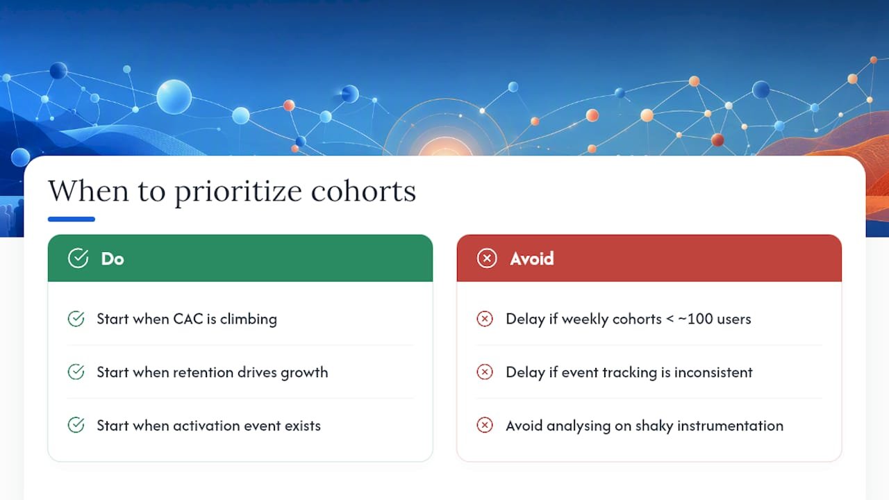
It is fair to delay cohort work when your weekly active cohorts are small (under roughly 100 users) or your event tracking is still inconsistent. A cohort analysis built on shaky instrumentation just produces confident-looking noise, and fixing tracking first is the better use of an analyst’s week.
For teams ready to start, a workable cadence is weekly early-life retention checks (D1, D7), monthly LTV and net dollar retention reads, and a quarterly governance review of definitions and sample sizes. IMD’s guidance on marketing analytics frames this well: define terms crisply, build the baseline dashboard first, then run targeted experiments against it rather than redesigning the whole model every quarter.
— Don
Turning cohort insight into a working pipeline
Building one clean retention triangle in a spreadsheet is a good exercise. Running that same analysis reliably, every week, across every acquisition channel, feeding straight into the campaigns your team actually launches, is a different job entirely. That is where Brainiac Consulting’s AI operations platform comes in: it automates the pipeline behind the triangle, from event extraction to the cohort grid to the CRM workflow that acts on it.

If your team already has the data but not the connective layer, our custom AI agents can be built around your existing warehouse and your Salesforce or HubSpot instance, so cohort segments update automatically rather than getting rebuilt by hand every month. For teams weighing lifecycle messaging alongside cohort activation, Preferic’s work on content and retention marketing is worth a look as a complementary resource. A practical first step: run a short pipeline audit with us, pilot one cohort report end to end, and decide from there whether a full integration sprint makes sense. Book an audit to see where your current cohort setup stands.
Sources
- How cohort analysis improves marketing decisions — TechTarget
- Cohort analysis in 2026: How to read the chart, choose a platform, and turn retention into growth — Mixpanel
- How to do cohort analysis: retention, revenue, and behavioral cohorts — Basedash
- Marketing analytics — IMD blog
FAQ
Can you give me an example of a cohort analysis?
A retention triangle grouping customers by sign-up week, then tracking what percentage stay active in each following week, is the standard example. A revenue cohort tracking net dollar retention by first-purchase month is the equivalent for monetization.
What are cohorts in marketing?
A cohort is a group of customers who share a starting point, such as sign-up date or first purchase, tracked together so their behaviour over time can be compared against other cohorts rather than blended into one average.
How do I create a cohort analysis?
Define the anchor event and the activity rule, choose weekly or monthly granularity based on your volume, extract the data with a date_trunc cohort key and offset columns, then pivot the result into a retention triangle and read it column by column.
What are the different types of cohort analysis?
The three main types are acquisition (time-based) cohorts, behavioural (event-based) cohorts, and revenue (dollar) cohorts, each answering a different question about retention, activation, or monetization.
How large does a cohort need to be for the results to be reliable?
Roughly 100 users per cohort is a reasonable floor for weekly cohorts; smaller groups tend to swing wildly on small changes and should be read as directional at best.