

Self-serve analytics lets business users, not just analysts or IT teams, query governed data and build their own reports through visual tools, dashboards, or natural-language search. It works best when paired with strong governance, benefiting marketing, sales, and finance leaders who need answers faster than a traditional request queue allows. Without that governance layer, though, it just creates faster ways to get the wrong number.
TL;DR:
- Without strong governance, self-serve analytics risk producing inconsistent and potentially misleading numbers from unverified or siloed datasets.
- Effective platforms must connect directly to live data sources, offer role-based governance controls, and provide explainability for AI-driven insights.
- Implementing self-serve analytics through phased pilots and a certified data layer increases adoption and reduces shadow reporting or fragmented metrics.
- Relying solely on features like visualization and AI insights ignores critical issues of data lineage, trust, and user adoption, which are essential for success.
- Building a governed data foundation and involving internal champions significantly improves trust, accuracy, and long-term scalability of self-serve analytics programs.
Table of Contents
- What self-serve analytics means and how it works
- The business case: efficiency, accuracy, and faster decisions
- What to look for in a self-serve analytics platform
- Step-by-step implementation guide and best practices
- Data governance, privacy, and the risks nobody talks about
- Tool categories and example workflows
- Brainiac Consulting’s perspective and evidence
- What the tooling debate misses
- How Brainiac Consulting helps you scale self-serve analytics safely
- Sources
What self-serve analytics means and how it works
Self-serve analytics, sometimes called self-service business intelligence, describes a system where business users pull their own insights from data without filing a ticket with an analyst. The architecture behind it follows a predictable flow: raw data lands in a warehouse, gets modelled into a governed data catalogue with agreed definitions, then surfaces through an analytics layer that non-technical users can actually touch. IBM’s framing of self-service analytics describes this same progression, from ingestion through semantic modelling to the front-end interface people interact with daily.
That front end usually takes one of three shapes:
- Drag-and-drop visual builders, where users assemble charts by dragging fields onto a canvas.
- Natural-language query (NLQ), where someone types “show me Q3 revenue by region” and gets a chart back.
- Pre-built dashboards, which offer less flexibility but faster time-to-first-insight for casual users.
The value shows up across four types of analytics: descriptive (what happened), diagnostic (why it happened), predictive (what will happen), and prescriptive (what to do about it). Most organizations start with descriptive dashboards and only reach predictive or prescriptive capability once the governance and data foundation underneath is solid. Skipping that sequencing is where most self-serve rollouts stall.
The business case: efficiency, accuracy, and faster decisions
The pitch for self-serve analytics is straightforward: it collapses the distance between a question and an answer. A sales ops manager who used to wait three days for an analyst to pull a churn report can now build it herself in twenty minutes. That shift compounds across an organization.
The gains tend to cluster around a few outcomes:
- Faster decisions. Teams act on data while it’s still relevant instead of waiting on a queue.
- Lighter analyst backlog. Analysts spend less time on repetitive pulls and more on the questions that actually need expertise.
- Better consistency. When everyone works from the same certified datasets, fewer meetings devolve into arguments over whose number is right.
- Stronger data literacy. Regular hands-on use builds intuition for what the numbers mean, not just how to read them.
Pro Tip: Track the reduction in ad-hoc data requests to IT or analytics teams as your clearest adoption signal. A significant drop in ticket volume after rollout tells you the self-serve layer is actually being used, not just deployed.
The KPIs worth watching are time-to-insight, dashboard adoption rate across departments, and the volume of one-off analyst requests. If none of those move after rollout, the tooling isn’t the problem. The habit-forming layer around it is.
What to look for in a self-serve analytics platform
Most platform evaluations get hijacked by feature checklists that don’t map to what actually determines success. Here’s the checklist that matters, in the order it matters:
- Ease of use. NLQ, visual builders, and pre-built templates should let a marketing manager build a working report without a training session. If it takes a manual, it won’t get adopted.
- Live connectivity. The platform needs to connect directly to your data warehouse, CRM, and ERP systems, not rely on stale exports. A dashboard built on last week’s Salesforce data is worse than no dashboard at all.
- Governance controls. Look for lineage tracking, certified datasets, and row- and column-level access controls baked into the platform, not bolted on afterward.
- Scalability. Test how the platform performs with dozens of concurrent users running complex queries, not just a demo with one analyst.
- Augmented analytics and explainability. AI-driven anomaly detection and auto-generated insights are genuinely useful, but only if the platform shows its reasoning. A prediction with no explanation is a black box you shouldn’t trust with a budget decision.
- Embedding, APIs, and alerts. The best platforms let you push insights into the tools people already use, Slack alerts, embedded dashboards in a CRM, rather than forcing everyone to log into a separate app.
Pro Tip: Weight governance and scalability higher than visual polish during evaluation. A platform with a clunky interface but airtight lineage tracking will outlast a beautiful dashboard tool that can’t survive a compliance audit.
Analyst guidance on the broader integration and BI market consistently points to governed data catalogues and lineage as the foundation layer that everything else depends on.
Step-by-step implementation guide and best practices
Rolling out self-serve analytics well means resisting the urge to hand every department a login and hope for the best. A phased approach works better.
- Design a pilot. Choose two or three high-value use cases, marketing attribution and sales pipeline velocity are common starting points, and define success metrics and a timebox (six to eight weeks) up front.
- Build the data foundation. Centralize data in a warehouse, automate the pipelines feeding it, and stand up a governed catalogue before opening access to anyone outside the pilot group.
- Create a semantic layer. Define standard metrics once, revenue, qualified lead, churn, so every dashboard pulls from the same definition instead of a dozen slightly different spreadsheet formulas.
- Enable users. Roll out role-based templates so a finance manager and a sales rep each get a starting point suited to their job, not a blank canvas. Vendor guidance on rollout sequencing consistently recommends this five-step arc: secure access, define metrics, pilot, train, iterate.
- Operationalize it. Monitor usage analytics, track which dashboards get opened and which get ignored, and build a feedback loop so the platform evolves with actual behaviour instead of assumptions.
A champions program, where a handful of enthusiastic early adopters in each department mentor their peers, tends to outperform formal training sessions. Adoption data from BI platform providers backs this pattern: role-specific templates paired with internal champions consistently drive higher usage than generic onboarding.
Two pitfalls sink most rollouts. Shadow reporting, where teams keep building competing spreadsheets outside the governed platform because it’s faster in the moment, undermines the whole point. Fragmented metrics, where marketing and finance each define “conversion rate” differently, will quietly poison trust in every dashboard downstream.
Data governance, privacy, and the risks nobody talks about
Governance isn’t the bureaucratic layer that slows self-serve analytics down. It’s the reason people trust the numbers enough to act on them. A platform that lets anyone query anything without controls doesn’t create empowerment, it creates fifteen versions of the truth by Friday.
The controls that matter most:
- Row- and column-level security so sensitive data (salaries, individual customer records) stays restricted by role.
- Certified datasets that carry a visible “trusted source” label, so users know which numbers are safe to cite in a board deck.
- Lineage tracking and access audits that show where a number came from and who touched it.
- Data observability tools that flag anomalies or broken pipelines before a bad number reaches a dashboard.
Privacy discipline matters just as much: minimize personally identifiable information in any dataset exposed to broad self-serve access, and mask or aggregate it where the business question doesn’t require individual-level detail.
The balance to strike is autonomy with guardrails, not autonomy instead of guardrails. Analyst research on scaling self-service programs treats governed catalogues and observability as prerequisites for scale, not optional add-ons layered in after something breaks.
Tool categories and example workflows
Feature comparisons across the self-serve analytics market tend to blur into marketing language, but the functional categories are consistent regardless of vendor:
- Visual builders for drag-and-drop chart creation, best for users who think visually and need speed over customization.
- Natural-language query for anyone who’d rather type a question than learn a query syntax.
- Embedded analytics that push dashboards directly into the tools teams already use, a CRM, a finance system, rather than a separate destination.
- Data prep layers that clean and join data before it reaches the visualization layer.
- Collaboration features, comments, shared annotations, version history, that turn a static chart into a working conversation.
Custom, code-based visualization libraries like D3 fill a different niche: teams that need a bespoke chart type no off-the-shelf tool supports, at the cost of needing a developer to build it. Lightweight tools like Datawrapper show the opposite end of that spectrum, publishing a clean chart in minutes with no code at all.
A marketing analyst might build a campaign attribution dashboard with NLQ for quick ad-hoc questions. A sales ops lead might embed pipeline velocity metrics directly inside the CRM so reps never leave their workflow. A finance manager typically prefers a standalone, tightly governed dashboard for board reporting, where auditability matters more than speed. Embedding wins when the insight needs to live inside an existing workflow; a standalone dashboard wins when the audience needs a single source of truth they revisit repeatedly.
Brainiac Consulting’s perspective and evidence
Brainiacconsulting builds governed AI analytics systems for marketing, sales, and finance teams, and the pattern holds across engagements: tooling rarely fails, but governance and adoption planning do. The AI Analytics Platform and governed AI analyst service pairs a certified data layer with an AI analyst that answers natural-language questions while staying inside defined access controls, so speed doesn’t come at the cost of accuracy.
Typical engagements follow a pilot-to-scale arc:
- Two to four weeks establishing a certified dataset and semantic layer around one or two priority use cases.
- Integration with existing systems, Salesforce and HubSpot most commonly, so the analytics layer reflects live pipeline and customer data rather than exports.
- A phased expansion to additional teams once adoption metrics from the pilot justify it.
For teams already deep in Tableau, Brainiacconsulting’s Tableau service extends governed self-serve capability without ripping out existing dashboards.
What the tooling debate misses
Most vendor content treats self-serve analytics as a feature race, more chart types, faster NLQ, flashier AI insights. That framing misses where the real failures happen, which is almost always governance and adoption planning, not the interface layer.
Two lessons show up repeatedly. First, teams that skip the semantic layer and let each department define its own metrics end up with a self-serve platform that generates confident-looking contradictions. Second, adoption dies quietly when there’s no champion inside a department pushing peers to actually use the thing, no matter how good the tool is.
If you’re starting from zero, don’t buy a platform first. Launch a two-week pilot around one certified dataset and one real business question, and see whether people actually come back to it.
— Don
How Brainiac Consulting helps you scale self-serve analytics safely
There are other paths to self-serve analytics: off-the-shelf BI tools, in-house dashboard builds, or a slow department-by-department rollout with no central governance. Each of those tends to hit the same wall eventually, fragmented metrics, shadow spreadsheets, and a platform nobody fully trusts.
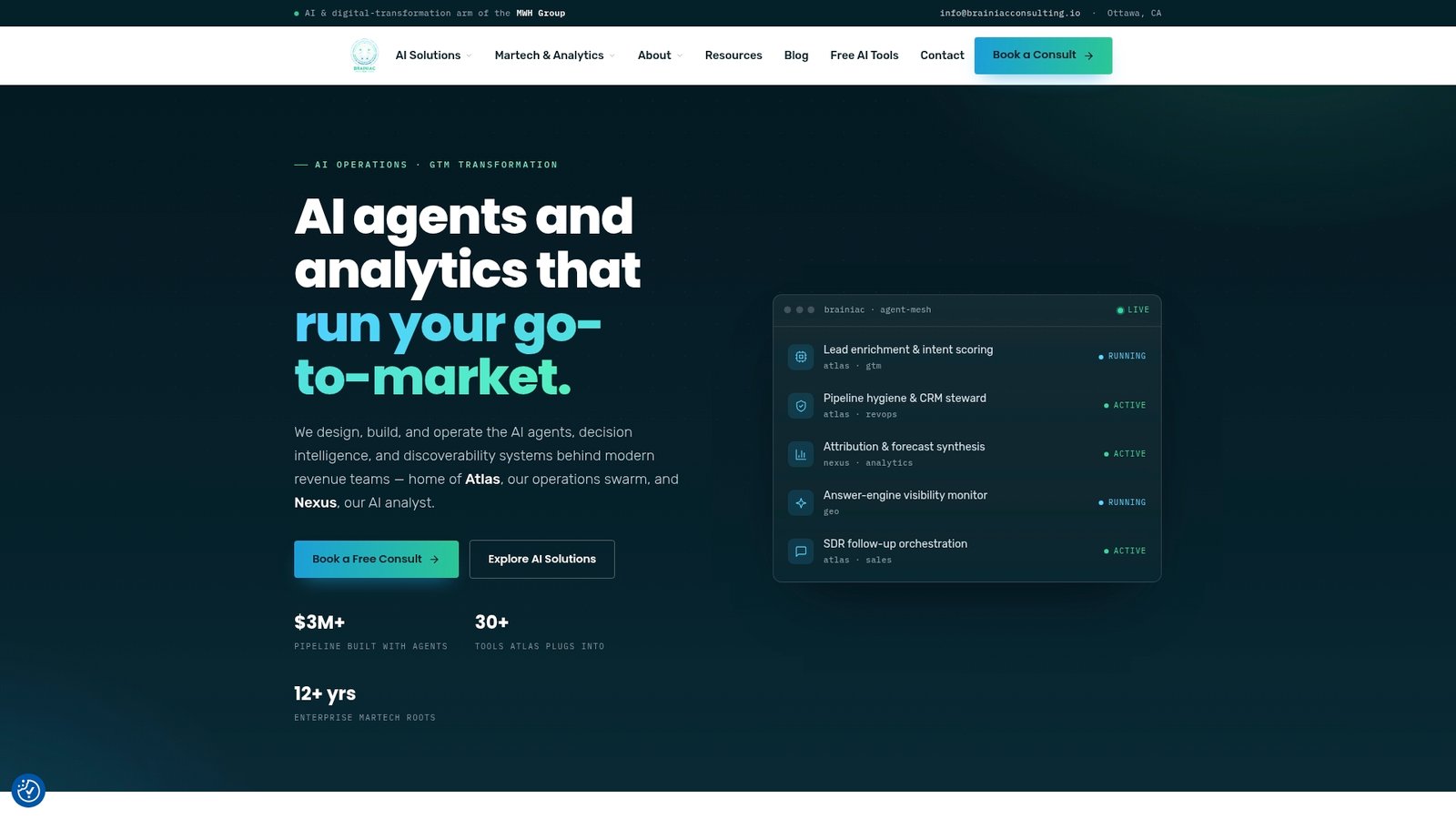
Brainiacconsulting takes a different route: we design and operate the governed data layer and AI analyst underneath your self-serve tools, so the dashboards your teams build actually rest on certified, audited data instead of best guesses. Our Atlas AI Operations Platform connects directly with Salesforce, HubSpot, and Marketo, meaning your marketing, sales, and finance teams query live pipeline data rather than a stale export. Clients typically see faster time-to-insight and a measurable drop in one-off analyst requests within the first pilot cycle. If you’re ready to see whether your current data foundation can support real self-serve access, request an AI analytics assessment and we’ll map out what a governed pilot looks like for your team.
Sources
For deeper background on the architecture behind self-serve analytics, IBM’s overview of self-service analytics covers the pipeline-to-interface flow in more technical detail. Analyst guidance from Gartner offers a useful reference point on governance maturity, and practitioner discussion on Reddit’s r/BusinessIntelligence is worth a read for how inconsistently the term gets used in practice. Third-party coverage of AI tools for data analysis from Baitless tracks the augmented analytics space as it evolves. Readers evaluating whether an AI-driven analytics layer is accurate enough for their own use case should start with our own guide to evaluating AI analytics accuracy.
- D3 — Data-Driven Documents
- Datawrapper: Create charts, maps, and tables
- Gartner — market and product guidance