

The revenue metrics worth tracking are total revenue, ARR or MRR, bookings, gross and net revenue retention, customer lifetime value, customer acquisition cost, pipeline coverage, and forecast accuracy. Build two dashboards first: an executive revenue summary and a pipeline and forecast dashboard. Everything else depends on clean source data and a clear reconciliation path to GAAP, including remaining performance obligation under ASC 606.
TL;DR:
- Dashboards must clearly define and reconcile metrics like bookings, ARR, and retention to ensure trust and accurate decision-making.
- Different stakeholder groups require tailored dashboards focused on their specific questions, such as pipeline health or customer renewal risk.
- Integrating AI-driven automation can update dashboards continuously, improving forecast accuracy and operational responsiveness.
- Reliable source systems and regular reconciliation, including GAAP and RPO considerations, are critical for trustworthy revenue metrics.
- Building phased, goals-driven implementation, with ownership and governance, helps avoid common pitfalls and ensures dashboard effectiveness.
Table of Contents
- What a revenue dashboard is and who should use it
- Core revenue metrics to include
- Which revenue dashboard should you build for each job
- How to structure dashboards for stakeholders and set review cadence
- Data hygiene, source mapping, and visualization best practices
- How automation changes what a revenue dashboard can do
- What we’ve learned building revenue dashboards
- How Brainiac Consulting turns dashboards into decision engines
- FAQ
- Sources
What a revenue dashboard is and who should use it
A revenue dashboard is an integrated visual interface that pulls signals from your CRM, billing system, and general ledger and turns them into decision-ready insight. Done well, it answers a specific question for a specific person: are we on pace, where is the risk, and what needs attention this week. Done poorly, it becomes a wall of charts nobody trusts.
The primary users differ in what they need from the same underlying numbers. RevOps teams use dashboards to monitor pipeline health and data quality. Finance leaders need figures that tie back to recognised revenue and support board reporting. Sales leadership wants forecast accuracy and deal-level risk. Marketing needs to see which channels are actually contributing to pipeline, and customer success teams track renewal risk and expansion opportunity.
The use cases stack naturally. Daily monitoring catches operational exceptions, like a sudden drop in lead flow or a stalled deal. Weekly reviews refine the forecast. Monthly cycles reconcile bookings against recognised revenue for the close process, and quarterly reporting rolls everything into the board deck. A dashboard built around one of these cadences rarely serves the others well, which is why most organisations end up needing more than one view, not a single master screen.

Core revenue metrics to include
Before you build anything, agree on definitions. Half of dashboard distrust comes from two teams using the same metric name for different calculations.
Start with the top line. Total revenue and revenue by stream show where the business stands today. Bookings record signed contract value, while ARR (annual recurring revenue), MRR (monthly recurring revenue), and ACV (annual contract value) describe the recurring base at different time horizons. The nuance matters: a large multi-year booking inflates ARR optics if you annualize it carelessly, so define whether ARR includes one-time fees or only recurring line items, and apply that definition everywhere.
Customer health metrics tell you whether the base is growing or eroding quietly.
- Gross churn rate measures revenue lost from cancellations, separate from downgrades.
- Net revenue retention (NRR) nets churn against expansion revenue within the existing customer base.
- ARPA (average revenue per account) and customer lifetime value (LTV) frame how much a customer is worth over time.
- CAC payback period shows how many months of revenue it takes to recover the cost of acquiring that customer.
Acquisition efficiency rounds out the customer side. Customer acquisition cost (CAC) paired with win rate and a sales efficiency ratio tells you whether growth is getting cheaper or more expensive to produce.
Pipeline and forecast metrics are where most dashboards fall short because they conflate activity with progress. Pipeline coverage ratio compares open pipeline value to the revenue target, usually expressed as a multiple. Committed pipeline separates deals sales has formally committed to close from best-case guesses. Forecast accuracy tracks how close predicted revenue came to actuals, and velocity measures how fast deals move through stages. Stage conversion rates expose where deals stall.
Financial controls connect the commercial numbers to the accounting ones. Bookings need to reconcile to recognised revenue, and that reconciliation runs through remaining performance obligation (RPO), the contracted revenue not yet recognised under ASC 606. Public filings illustrate how material this gap can be: disclosed RPO figures across recent filings are often substantial and are typically split into 12-month and 36-month satisfaction buckets, as shown in SEC revenue recognition disclosures. A dashboard that shows bookings growth without a view into RPO timing can overstate near-term revenue health.
For visualization, trend lines work for top-line revenue over time, cohort charts are built for retention and churn, and a waterfall chart is the clearest way to show bookings flowing into recognised revenue, deferred revenue, and future recognition.
Pro Tip: Define every metric in a shared glossary before you build a single chart. It saves more rework than any visualization choice ever will.
Which revenue dashboard should you build for each job
Different questions call for different dashboards, and each should carry the minimum set of widgets that actually answers its question rather than everything available.
- Executive revenue summary: top-line revenue against target, trend over time, NRR, and bookings compared to recognised revenue.
- Pipeline and forecast dashboard: committed versus best-case pipeline, coverage ratio, forecast accuracy over recent periods, and a list of top deals with risk flags.
- Marketing-to-revenue dashboard: channel-attributed pipeline, cost per qualified lead, and each channel’s pipeline contribution.
- Customer success dashboard: churn drivers, expansion revenue, renewal pipeline, and account health scores.
- Sales activity dashboard: the funnel from activity to conversion, with rep-level KPIs used for coaching rather than top-down reporting.
Template libraries built around these same categories, including executive summaries, retention cohorts, and bookings-versus-recognised-revenue widgets, confirm this is the common starting structure businesses reach for, as described in revenue dashboard templates. Build the executive summary and the pipeline dashboard first. The other three matter, but they support functional teams rather than company-wide decisions, so they can follow once the core two are trusted.
How to structure dashboards for stakeholders and set review cadence
A dashboard only works when it’s built for a specific audience and reviewed on a cadence that matches the decisions it supports. An executive doesn’t need stage-level pipeline detail, and a sales manager doesn’t need the GAAP reconciliation footnotes.
Match the view to the audience and the rhythm:
- Operational teams check exception-based metrics daily, like a sudden pipeline drop or a data sync failure.
- Sales and RevOps review pipeline and forecast dashboards weekly.
- Finance reconciles bookings to recognised revenue monthly, tied to the close process.
- The board or leadership team sees a quarterly snapshot built from the executive summary.
Design around one primary action per dashboard. If a chart doesn’t lead to a decision, it’s decoration. Every dashboard needs a named owner, a service-level agreement for how fast anomalies get investigated, and alert thresholds that trigger a notification rather than requiring someone to notice a dip on their own. When an exception fires, assign an owner, set a remediation deadline, and log what was decided. Over a few cycles, that log becomes its own record of what actually moves the numbers.
Data hygiene, source mapping, and visualization best practices
Dashboards are only as trustworthy as the systems feeding them. Most revenue dashboard failures trace back to three systems disagreeing: the CRM, the billing platform, and the general ledger.
- Map every metric to a single source of truth, and document where each number originates.
- Reconcile non-GAAP metrics like ARR and bookings to GAAP recognised revenue on a defined schedule, not ad hoc. Public companies routinely present ARR and bookings alongside GAAP figures with formal reconciliations in their investor materials, as shown in IBM’s non-GAAP supplemental disclosures.
- Decide deliberately between real-time and audited figures. Real-time data is useful for operational alerts, but it will drift from the finalized numbers finance reports externally, so label which is which.
- Keep chart axes consistent and avoid truncating them to exaggerate a trend. Use cohort analysis for retention instead of a single blended churn number, which hides which customer segments are actually at risk.
Pro Tip: Put a “last reconciled” timestamp on every dashboard that touches revenue figures. It stops arguments before they start.
Our internal guide to RevOps measurement frameworks goes deeper into governance models for teams building this out from scratch.
How automation changes what a revenue dashboard can do
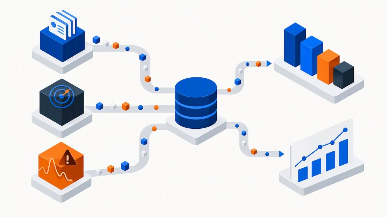
Static dashboards tell you what happened. Automated ones start to tell you what to do about it. Lead enrichment, intent scoring, and anomaly detection can run continuously in the background, updating pipeline composition and forecasts without someone manually refreshing a spreadsheet.
The adoption curve backs this up: Gartner found that 58% of finance functions were already using AI in some capacity by 2024, which suggests automation in analytics has moved well past the experimental stage, according to Gartner’s survey of finance functions.
Organisations that embed execution discipline alongside automation see forecast accuracy improve significantly, according to a 2026 GTM benchmark report, which tells you the gain comes from process as much as the model itself.
Before adopting any AI layer for your dashboards, evaluate it against a short checklist:
- Does it integrate with your existing CRM and billing systems without a rebuild.
- Can it explain why it flagged an anomaly or adjusted a forecast.
- Does it maintain an audit trail for compliance and reconciliation.
- Who governs changes to the models or scoring logic over time.
What we’ve learned building revenue dashboards
Most teams build their first dashboard around whatever metrics are easiest to pull, not the ones that predict trouble early. That habit produces a wall of vanity numbers that look fine right up until revenue misses.
A 90-day approach works better than a big-bang launch. In the first 30 days, verify your data sources and run basic sanity checks, like confirming bookings in the CRM match signed contract value in billing. In the next 30, automate the recurring reports and assign clear owners to each metric. In the final 30, formalize governance: who can change a metric definition, and how exceptions get escalated.
The most common pitfalls are the same ones every time: tracking activity instead of outcomes, skipping the GAAP reconciliation until the board asks for it, and leaving metrics without a named owner.
— Don
How Brainiac Consulting turns dashboards into decision engines
Most of the work in this article, defining metrics, mapping sources, reconciling GAAP, is the groundwork. The payoff comes when that groundwork runs itself. AI agents can handle lead enrichment, intent scoring, and pipeline hygiene continuously, so dashboards update without manual reconciliation across multiple systems.
Our AI-Enabled Analytics work is built around open-source deployments and integrations with platforms like Salesforce, HubSpot, and Tableau, so you keep full visibility into how a number was calculated rather than trusting a black box. For teams specifically trying to connect marketing spend to revenue, our Marketing Operations Optimization and Support service addresses attribution and campaign-to-pipeline mapping directly. If you’re earlier in the process and want to size the opportunity before committing, our AI Strategy & Readiness Advisory work includes a readiness baseline and a roadmap built around your current systems.
If you want to see what a governed, automated revenue dashboard looks like for your business, visit Brainiac Consulting to start a discovery conversation.
FAQ
What are metrics in a dashboard?
Metrics in a dashboard are the specific, defined measurements, like revenue, churn, or pipeline coverage, that are visualized so a team can monitor performance against a target. Each metric needs a documented calculation method so different teams interpret the same number consistently.
What are some common metrics used to measure revenue?
Common revenue metrics include total revenue, ARR or MRR, bookings, net revenue retention, customer lifetime value, and customer acquisition cost. Pipeline coverage and forecast accuracy are also tracked alongside these to anticipate where revenue is headed, not just where it stands today.
What are the top dashboard tools?
Tool choice depends on your existing stack and whether you need built-in CRM integration, custom visualization, or governed AI analysis layered on top of raw data. Platforms like Tableau and Power BI handle visualization, while CRM-native reporting in Salesforce or HubSpot covers simpler needs, and some organisations add an AI analytics layer such as Brainiac’s AI-Enabled Analytics for automated monitoring and governance.
What are the pillars of revenue management?
Definitions vary across industries, but a common framing covers demand forecasting, pricing and packaging, pipeline and inventory management, customer retention, and performance measurement through dashboards and reporting. Each pillar depends on accurate, reconciled data flowing from the same source systems discussed throughout this guide.
How often should a revenue dashboard be updated?
Operational dashboards tracking pipeline and activity should refresh daily to catch issues early, while financial dashboards tied to recognised revenue typically update on a monthly close cycle. The right cadence depends on whether the audience needs real-time signals or audited figures suitable for board reporting.
Sources
- Revenue Recognition – Narrative (Details)
- 2026 GTM benchmark report
- Gartner press release on AI use in finance